Summary:
Introduction to Data Visualisation
- It is a mass medium
- Essential part of communication process
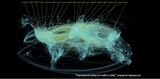
- “23 Exabytes* of information was recorded & replicated in 2002. We now record & transfer that much information every 7 days.” – How much information? 2003
- everyday people generate so much data, just from facebook , social media etc
- we live in a complex data economy
- What is Data? – data values quantity, can visualised using graphs & Infographs.
- “Data on its own carries no meaning, it must be interpreted & take on a meaning to become information.”
- Data is measurement
- It involves creation & study of data which has been schematically formed.
- Primary goal of Data vis – is to communicate information clearly, using statistical graphics & Infographs.
- Difference between Infographs & Data Vis? – “not all information visualisations are based on data, but all data visualisations are information visualisations”
- ‘it makes complex data more accessible, understandable & usable.’
- ‘Users may have particular analytical tasks such as making comparisons.’

Reflection:
- Designers engage with forms of data to make them for digestible, the scope of data is rapidly increasing, we live in a “tsunami of data”, everyday people create a massive trail of personal data. Infographs can appear as data visualisations, however, they can be inaccurate/ non-meaning-full representations. ‘Effective visualization helps users analyse & reason about data & evidence’
- It is both an art & a science
- Presents ethical & analytical challenged to designers.
Activity:
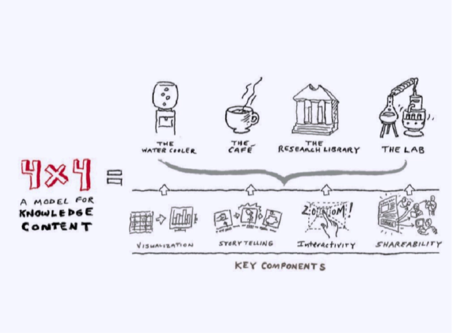
The 4X4 Model for Winning Knowledge Content.
Bill Shander of Beehive Media at KA Connect 2014
Summary graphic of the model:
References:
Shedroff, N. (2014). Information interaction design a unified field theory of design.Retrieved from http://nathan.com/information-interaction-design-a-unified-field-theory-of-design/
Waterson, S. (2016). DataVis POD01 – What is Data Vis? [Lecture Pod]. Retrieved from https://vimeo.com/175177926
